
Behind the Packaging: Meet Clydebuilt Designer Rory Dowling
13th November 2026
 Every bottle tells a story before it’s even opened. For the Clydebuilt rebrand, the design needed to carry a lot: the skill of whisky-making, the proud shipbuilding heritage of the River Clyde, and the innovative spirit of Ardgowan Distillery Company.
The man behind the project is Irish designer Rory Dowling. We asked Rory how he got into packaging design and how the new look came together over 18 months.
∞ ∞ ∞ ∞ ∞
Tell us a little about yourself and how you got into packaging design.
I grew up in Gorey, a small town in Ireland that has a very rich cultural life. We had the first arts centre in Ireland that ran for a few weeks each summer, when visiting artists and performers made our little town blaze into life and colour. This, combined with various inspirational teachers, pointed me in the direction of a career in art and design.
I studied graphic design in Waterford and Dublin, and on graduating I was lucky enough to join a studio that specialised in packaging design. I was mentored by some of Ireland’s most distinguished designers, and I got to work on many iconic Irish and international brands. I have always loved packaging design as it is the part of graphic design that has the most touchpoints with ordinary people at all levels, from budget to ultra-premium. I love the way there is always a story or a strategy behind the brands, and combining this with craft and creative thinking, we can create magic.
How does designing for a Scotch whisky brand differ from other products?
Scotch Whisky has such a deep rooted heritage and sense of craft. I love that it is so embedded in the history and traditions of Scotland and that the whisky itself reflects the landscape and the climate. It is also diverse, so within the Scotch Whisky family you can have very traditional expressions, but you can also be contemporary and innovative. This rich heritage and passion allows for much deeper storytelling than with other products. The care, craft and sense of tradition that goes into Scotch Whisky has strong parallels with the craft of graphic design.
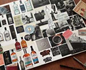
Can you outline the brief you were given? Which part did you enjoy getting your teeth into the most?
The brief was complex, with many strands to weave together. I had to create a design that reflected the Ardgowan story, the craft of whisky-making and the shipbuilding heritage of the Clyde.
While reflecting tradition, I was also to layer this with a modern sensibility that reflected the pioneering spirit of Ardgowan Distillery Company. Balancing all these elements is creatively challenging but hugely rewarding. The early stages, where I explored all options and ideas, were the most exciting. I also loved illustrating the antique style maps that we used for the bottles and cartons.
How do you approach a project like this, and how does it differ for an established brand compared to a new one?
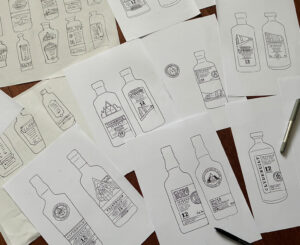
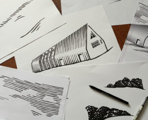
I start with research, thinking and sketches. For this project, I explored the world of the Clyde Shipyards – looking at lots of archive material and visual ephemera. I also visited the Ardgowan Distillery site at Bankfoot during and after construction to get a feel for both the building and the surrounding landscape at Inverkip. Then I sketch out lots of initial ideas. After refining, the initial sketches are shared with the client, and we review together, choosing the ideas with the most potential.
As Clydebuilt is ‘new’, there is a degree of freedom. If you are working on an established brand, it will already have an inbuilt, identifiable visual language – colour, imagery and typography that will have become iconic to it and that it can be dangerous to change. With a newer brand like Clydebuilt, you have the control to create these elements. They are newly minted now, but you hope they will become iconic and recognisable in time.
How did your design concepts evolve over the course of the project?
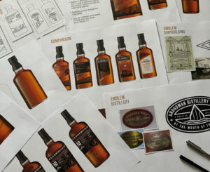 A lot of my early concepts were inspired by the iconic new Ardgowan Distillery Building, which is hugely evocative. I would have explored a lot of graphic treatments of the building, from traditional engravings to pared back graphic and geometric shapes inspired its triangular form and the way it interacts with the surrounding landscape. I also layered in subtle references to the Shipyards and the River Clyde itself. As the design evolved, I simplified it, paring away detail to reach a simpler, more pure essence of our theme.
The name Clydebuilt carries a lot of history. How did the river and its shipbuilding heritage inspire the design?
The Clydebuilt name is a huge inspiration. While we evoke the physical river and Firth literally with our bespoke maps, it means much more to us than just a geographical feature. The Clyde Shipyards were the pride of Scotland, and so many legendary vessels were designed, built and launched there.
Visually, I have drawn huge inspiration from both the blueprints of the ships and the ironwork and signage of the shipyards. I use typefaces that evoke both the heavy engineering of the Victorian era combined with lighter, more modern fonts that echo the elegant, streamlined era of the 1930s ocean liners. Generations of families – skilled artisan men and women worked in the shipyards and passed their skills from generation to generation. We wish to honour them with a rich sense of craft and pride in design and execution.
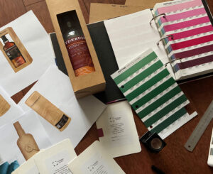 What role did sustainability play in your choice of materials and finishes?
Sustainability is a key bedrock of the Ardgowan Distillery Company ethos. The distillery’s efforts to minimise its environmental impact and the innovative way in which it repurposes its carbon emissions into clean renewable fuel must underpin every expression of the brand.
We took great pride in sourcing renewable and sustainable materials. Recent innovations mean sustainable materials no longer come with a visual deficit, and you can be both sustainable and visually beautiful.
How did you reflect the connection to Ardgowan Distillery, Clydebuilt’s brand home, while keeping the range distinctive?
 A key touchstone is the use of copper. While the bespoke pot stills are made from copper, the colour is also hugely iconic to Ardgowan, from the architecture of the new distilling hall to the colour of its beautiful metallic roof. The roof reflects the surrounding landscape and weather conditions, so it never seems to be the same colour twice, and these shades and variations are a huge inspiration to me when designing for the brand.
Creating synergy between the tradition of whisky-making and the more modern expression of the building and its environmental credentials is something I try to evoke in the designs.
How did it feel seeing the finished packs for the first time, and how do you hope others feel when they see them?
It’s a huge thrill when all that hard work and creative thinking result in a great finished design. The beautiful materials we chose and the craft details, such as the engraved bottles, all combine into something to be really proud of. I hope they speak to consumers of the craft and heritage behind the Ardgowan brand but also feel modern and accessible. I hope they evoke the Clyde and the great shipyards and tell their story in a simple manner, but that they will reveal themselves in layers as you look closer at the fine details.
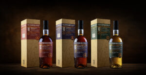
Which of the three new expressions would you pour for yourself, and why?
It’s an embarrassment of riches, but I’m most drawn to the 10 Year Old Sherry Cask Matured. Its promise of echoes of fruitcake, sweet spices and silky honey seems perfect for dark winter evenings. I won’t uncork it yet as it seems ideal for Christmas, when it will bring great comfort in the cold midwinter. I will wait until my world quietens down and will savour it when I’ve a roaring fire set, candles lit and vinyl spinning in the corner.
∞ ∞ ∞ ∞ ∞
Our thanks to Rory for sharing the thinking, craft and care behind the new Clydebuilt range. To see more of Rory’s work, visit rorydowling.com or follow him on Instagram at @rorydowlingpackdesign. If you’d like to explore the new range, you can find more details here or a stockist here.